The Food and Drugs Authority (FDA) has rebranded with the introduction of a new logo, key visuals and brand guidelines aimed at updating its corporate image to emotionally and visually entrench itself to stakeholders.
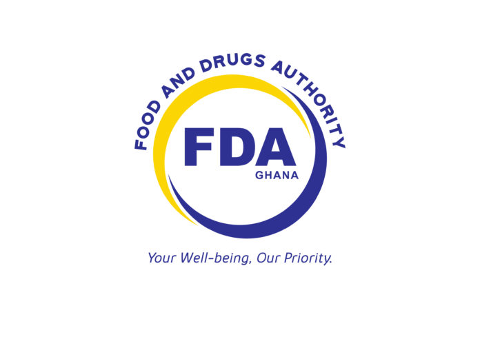
The logo consists of two arcs in yellow and blue which form a circle around the acronym, “FDA”, which is also spelt in full in the shape of an arc above the circle.
The interlocking arcs symbolize the FDA’s willingness to embrace engagement with stakeholders. The full circular shape of the arcs represent the complete 360 required checks the authority conducts to ensure consumer wellbeing.
Within the circle, “Ghana” sits beneath the A of FDA to specify the geographical location of the brand.
The Authority’s new tagline is empathetic and compelling which sits boldly under the lower arc forming a part of the logo.

Together with its bold brand colours, the new logo carries a sense of authenticity and warmth with the colour palette fully representing its corporate identity.
ALSO READ: FDA prevents harmful Myanmar rice from entering Ghana

“We saw our 20 years anniversary last year as a great opportunity to refresh our commitment and for a new more responsive, proactive, dynamic and consumer- accessible FDA to be at the heart of our new brand identity,” the CEO of the Authority Delese Mimi Darko said at the unveiling ceremony of the new FDA on Tuesday.
According to her, the current FDA logo has an old look and feel and they wanted the new logo to at least convey everything the FDA stands for (not just food and medicines – capsule and plate).


