A logo is a combination of text and imagery that convey the name of your business and creates a visual symbol that represents your vision. A good logo communicates your business quality and values which foster brand loyalty.
A logo is a company’s first introduction to consumers hence, your company’s chance to make a solid first impression. Several brands have been able to make that solid first impression and have a fascinating story behind it. For this reason, we are looking at some top food and beverage brand logos with their origin stories and meaning.
#1 Coca-Cola

Coca-Cola is a top beverage brand. It has been established as a world-famous and beloved beverage brand across the globe. Coca-Cola brings ‘happiness in a bottle’ and is enjoyed in 200 countries consuming a rate of 1.7 billion servings a day. The Coca-Cola Company with its headquarters based in Atlanta Georgia produces more than 2,800 other products that are enjoyed across the globe.
The Coca-Cola drink was originated in the year 1886 by the Atlanta Pharmacist Dr. John Pemberton but it was his partner and bookkeeper, Frank M. Robinson that came up with the name Coca-Cola and suggested that “the two Cs would look well in advertising”.
The earliest version of the logo was a simple handwritten Serif font of Coca-Cola. The logo soon evolved to a font type known as ‘Spencerian’ and would later move from a black and white typeface to a red and white type face.
The evolution of the Coca Cola logo

Image source: 1000 logos.
Red is a powerful colour that evokes excitement, passion, energy, and happiness which Coca-Cola reflects.
#2 Pepsi
Pepsi is another top beverage brand and Coca-Cola’s long-standing competitor. It’s been around for over 100 years. Pepsi was created in 1893 by Caleb Bradham in his Drug Store in New Bern, North Carolina. The original name of the Pepsi drink was called “Brad’s Drink” named after himself. The beverage was made up of a mix of sugar, water, caramel, lemon oil, nutmeg, and cola nuts.
On August 28th, 1898, Brad’s Drink was renamed Pepsi after the pepsin enzyme, one of the main ingredients of his drink. Bradham believed that his drink was a “healthy” cola that helped with digestion.
In 1903, Caleb Bradham formulated the logo for his beverage. It was the word “Pepsi Cola” in red hand-written font, with the letters P and C linked with each other. In 2008, Pepsi dolled out US$1 million for a new logo with embedded symbolic meaning.
The logo features three parts, a red top half, blue bottom half, separated by a wavy white line which creates a smile effect. The design represents the earth’s magnetic field, feng shui, Pythagoras geodynamics, the theory of relativity, and the golden ratio. The logo is also said to reference the Parthenon and the Mona Lisa.
Also, the Pepsi logo represents the “gravitational pull” of a can of Pepsi on a supermarket shelf.
The obscure symbolism of the logo was meant to add a more stunning appeal to the brand and stir up an emotional bond with customers.
The evolution of the Peps logo
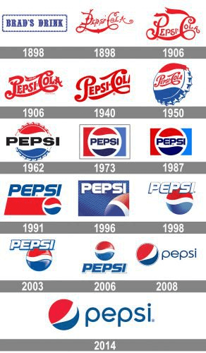
Image source: 1000 logos.
#3 KFC

Kentucky Fried Chicken (KFC ) is a top food brand and a fast-food chain since the 1950s with over 20,000 restaurants all around the world. The iconic logo of KFC features a man which can be viewed miles away. So, who’s the man? The man is Colonel Harland Sanders, founder of the KFC company. Colonel Harland Sanders was born in 1890 and grew up on a farm near Louisville, Kentucky. Sanders began selling fried chicken from his restaurant in 1930.
The original KFC logo was created by Lippincott & Margulies in 1952 with Colonel Sanders having a more serious expression that did not radiate warmth and had no welcoming approach. The logo was also in black and white with the inscription “Kentucky Fried Chicken” by the image of Colonel Sanders.
In 1978 Lippincott & Margulies gave Colonel Sanders a new facelift. Colonel Sanders had a warmth to his smile and a much more neat hairstyle.
In 1991, Colour was added to the KFC logo to give it a more lively image with the name Kentucky Fried Chicken abbreviated to “KFC.” It’s been said that the company wanted to get rid of the “Fried” in their name which had the connotation of unhealthy food.
The evolution of the KFC logo
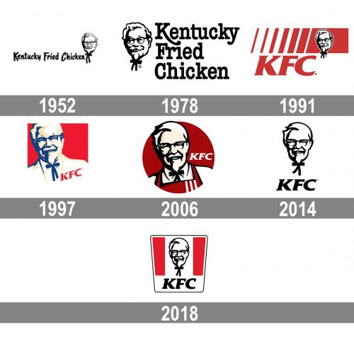
Image source: 1000 logos.
#4 Nestlé

Founded in 1866, Nestlé is one of the top food and beverage brands in the world if not the largest. Henri Nestlé, the company’s founder, worked as an assistant to a local pharmacist early in his career. An innovator by nature, Henri was trained in science and chemistry. In 1867, Henri Nestlé produced a nutritious combination of milk, wheat, and sugar. This cereal was so nutritious that it saved the life of a child. He called it Farine lactee (‘flour with milk’).
In 1868, the first Nestlé logo was created upon his family’s coat of arms which featured a single bird sitting on a nest. Henri Nestlé added three young birds to the adapted family coat of arms with the young birds being fed by a mother. This created a visual link between his name and his company’s infant cereal products. The logo was also a play of his family name Nestlé which means ‘nest’ in German. He began using the image as a trademark in 1868. Nestlé has modified its logo at least six times throughout its more than 150-year history.
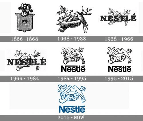
Image source: 1000 logos.
#5 Pizza Hut

Two brothers Dan and Frank Carney founded Pizza Hut in Wichita, Kansas in 1958. While in college, they borrowed $600 from their mother to convert a 600-square foot bar into a pizzeria. The sign on the bar had room for only 8 letters so the brothers came up with a name that could fit into the sign and thus, Pizza Hut was born.
The first logo was also introduced in 1958 which only featured the brand name in a simple sans serif typeface. The brothers later noticed the corporate branding of their rival Shakey’s Pizza and decided it was time to improve on their logo. The brothers contracted a renowned architect who built a mansard roof shape for their store which inspired their logo. The Pizza Hut logo was in use from 1967 to 1999. The logo went through further changes till what you see today.
The use of red in the Pizza Hut logo symbolizes freshness and passion, whereas the yellow color stands for richness, taste, and joy.
The current advertising slogan, “Make it great”, was introduced in 2012.
The evolution of the Pizza Hut Logo

Image source: 1000 logos.
Lessons
When designing a logo for your food and/or beverage brand, meaning, symbolism and attractiveness are everything as it is the first impression you will make on your customer. Ask yourself these questions…
- What feelings do I intend to invoke when customers see my logo?
- What is the narrative I am telling?
- Does my logo represent the brand I envision?
- What are the right colours to use to help make the intended impact with my logo?
For instance, by using the red colour in its logo design, Coca-Cola invokes passion, excitement and love for its products.

